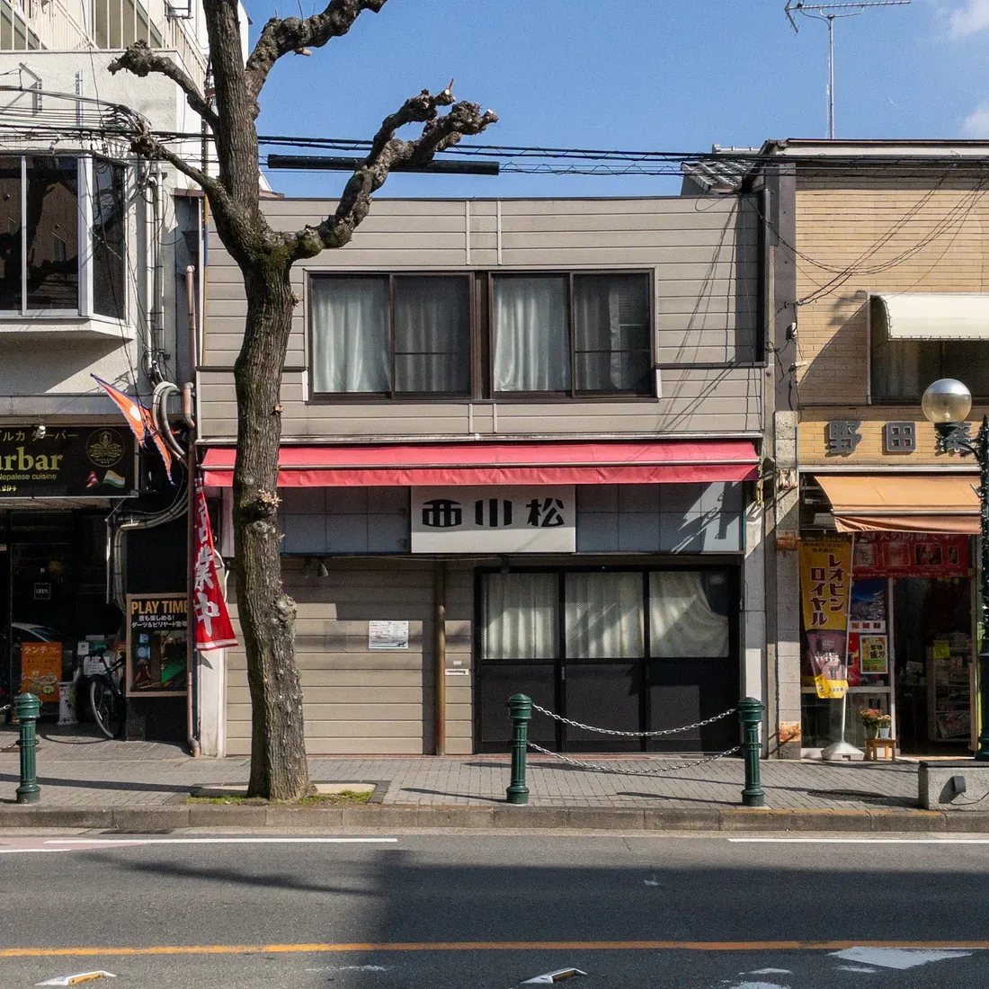
Nishi-Kawa-Matsu
OVERVIEW
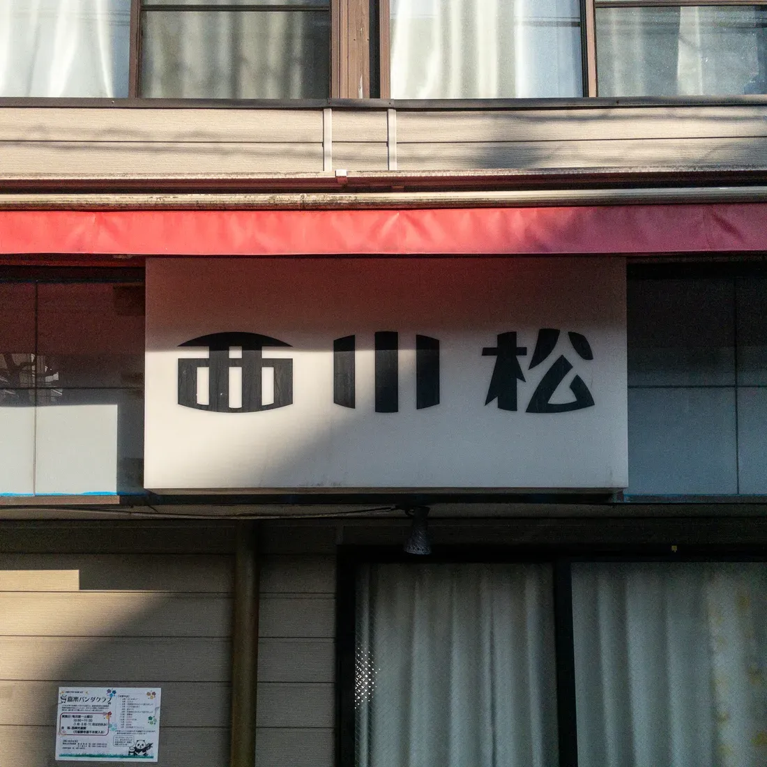
Rounded.
But not soft.
“Nishi” stands like a gate.
“Kawa” rises in three steady strokes.
“Matsu” plants its feet firmly on the ground.
Nishikawamatsu.
Just three characters.
No explanation.
No title.
And yet,
inside these black forms
linger the scent of business
and the memory of family time.
The strokes are thick.
The corners, decisive.
It feels almost like a family crest—
almost like a logo.
A minimalist emblem
born in a Showa-era shopping street.
It doesn’t decorate.
It doesn’t explain.
But it is strong.
Black on white.
Under a red awning,
holding the afternoon light.
This isn’t typography so much as
the spine of a shop.
Unrelated to trends,
it simply exists.
Even from across the road,
you know at once:
This is Nishikawamatsu.
Not a font—
but the shape of a name.
Standing in the town,
quietly,
and with pride.