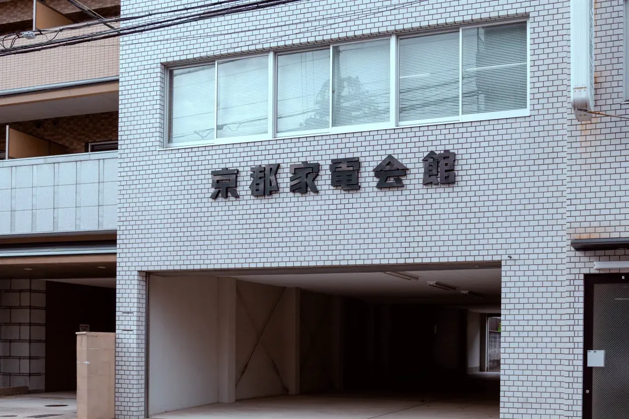
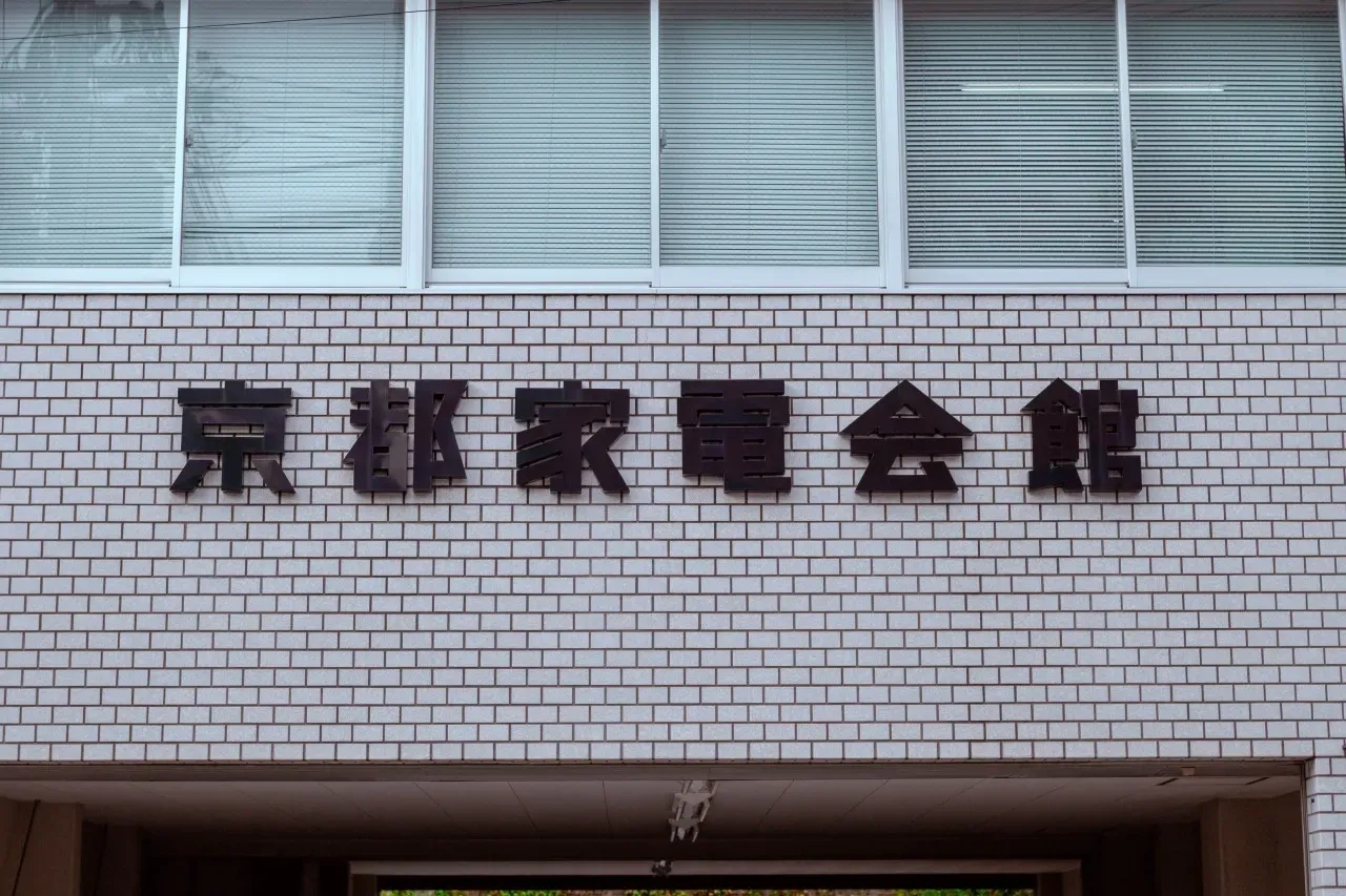
Kyoto Electric Appliance Hall
OVERVIEW
On white tiles, black letters.
Thick forms casting quiet shadows.
They don’t insist.
Yet they are undeniably there.
Kyoto Katei Kaikan.
Four unadorned characters.
Not a corporate logo,
not a commercial sign.
Something quieter—
the name of a place.
Sharp corners.
Straight lines.
Not a single unnecessary decoration.
And yet it isn’t cold—
perhaps because of the softness of the white tiles,
or the light that rounds their edges just slightly.
Perfectly aligned, vertical and horizontal.
Still, a trace of human presence remains.
The honest, solid block letters
so often found on Showa-era public buildings.
They do not chase trends.
They do not speak of design.
They simply say,
“It’s okay to gather here.”
Less a font
than the name of a vessel for the community.
Not flashy.
But unwavering.
This is not typography so much as
the breathing of the building itself.
Keeping rhythm with the grid of the tiles,
it stands there—
quietly—
again today.